
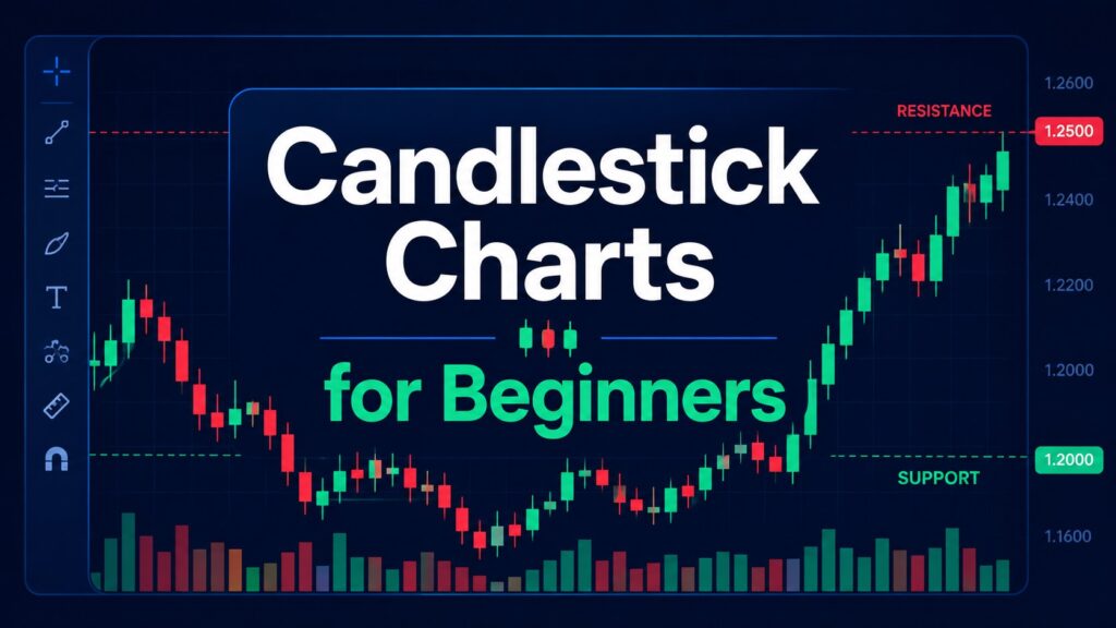
Candlestick charts for beginners can look confusing at first.
When you first open a chart, every red or green candle may feel like it is telling you to do something immediately. A big green candle can make you feel like you are missing out. A big red candle can make it feel like something is going wrong.
I used to think candlestick charts were mainly about memorizing candle names. Hammer, doji, engulfing candle, shooting star — it looked like each pattern had a fixed meaning.
But over time, I learned that the candle name is not the most important part.
The real question is this:
Where did the candle appear, and what does it say about buyers and sellers?
A candlestick chart can show whether buyers are stepping in near support, whether sellers are rejecting price near resistance, or whether a move is supported by strong volume. But candlestick charts are not magic signals.
A green candle does not mean “buy immediately.”
A red candle does not mean “sell everything.”
A hammer, a doji, or an engulfing candle does not guarantee a reversal.
A better approach is to read candlesticks inside a larger market context. That means checking the weekly chart, daily chart, trend, support, resistance, volume, and broader market conditions before making any interpretation.
This article explains how to read candlestick charts for beginners in a practical way, without relying on them blindly.
This article is for educational purposes only. It is not financial advice or a buy-or-sell recommendation.
What Is a Candlestick Chart?
A candlestick chart is a type of price chart that shows how an asset moved during a specific time period. For a basic reference, Investopedia provides a simple overview of how candlestick charts work.
For example, one candle on a daily chart represents one trading day. One candle on a weekly chart represents one trading week. On a 1-hour chart, one candle represents one hour.
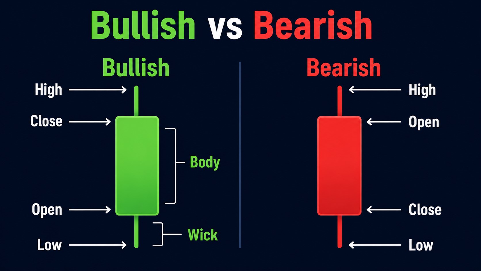
Each candle usually has four key prices:
| Candle Part | Meaning |
|---|---|
| Open | Price at the start of the period |
| High | Highest price during the period |
| Low | Lowest price during the period |
| Close | Price at the end of the period |
The thick part of the candle is called the body. The thin lines above and below the body are called wicks or shadows.
A green candle usually means the close was higher than the open. A red candle usually means the close was lower than the open.
That is the simple definition. But the useful question is deeper:
Who had more control during that candle — buyers or sellers?
If sellers pushed price down but buyers brought it back up before the close, the candle may show demand. If buyers pushed price higher but sellers forced it back down, the candle may show rejection.
That is why candlestick charts can be useful. They do not just show price. They show behavior.
Why Candlestick Charts Matter for Beginner Investors
For this reason, candlestick charts for beginners should be treated as a visual tool for understanding market behavior, not as a shortcut for predicting every price move.
Candlestick charts matter because they help investors see price behavior more clearly than a simple line chart.
A line chart usually shows only closing prices. A candlestick chart shows the full battle between buyers and sellers during each period.
This can help beginners notice things like:
- Price tried to fall, but buyers pushed it back up.
- Price tried to rise, but sellers rejected it.
- A breakout happened with strong volume.
- A rally failed near resistance.
- A stock is moving up, but momentum is weakening.
For beginner investors, this can be useful when looking at assets such as SPY, QQQ, TSLA, NVDA, Bitcoin, or broad market indexes like the Nasdaq.
The goal is not to predict every short-term move. The goal is to avoid making emotional decisions based on headlines or one dramatic price move.
In my view, the biggest value of candlestick charts is not finding a perfect entry. It is learning to slow down before reacting.
A candle should make you ask better questions. It should not make the decision for you.
Candlestick Charts for Beginners: Start With Context First
Many beginners make the same mistake. They open a chart, see one candle pattern, and immediately try to decide whether it is bullish or bearish.
That is backwards.
A candlestick pattern only matters when you know where it appears.
A long lower wick near support may show buyers defending an important area. The same candle in the middle of a messy sideways range may not mean much.
A big green candle after a long downtrend may be the start of a rebound. Or it may be just a temporary bounce before sellers return.
A doji candle near major resistance may show hesitation. A doji candle in the middle of a quiet range may not matter much at all.
Context comes first. Candle interpretation comes second.
This is why beginners should not ask only:
“What is this candle called?”
A better question is:
“Where is this candle forming, and what does it say about buyers and sellers?”
That small change can make candlestick charts much more useful.
When I first started reading candlestick charts, I made the common mistake of treating one strong candle as a complete signal. If I saw a big green candle, I assumed buyers were fully in control. If I saw a long red candle, I assumed the trend was already broken.
But many of those candles only made sense after I checked where they appeared. A strong candle near resistance was very different from a strong candle breaking above resistance with strong volume. A red candle near support was also different from a red candle breaking below support with heavy selling.
That experience changed the way I read charts. Now I try to ask where the candle is forming before I ask whether the candle looks bullish or bearish.
A Practical Chart-Reading Routine for Beginners
A simple routine is especially important when learning candlestick charts for beginners because it prevents you from reacting to one candle without checking the bigger picture.
When I review a chart, I do not start with the smallest timeframe. I usually begin with the larger picture first.
This helps me avoid reacting emotionally to one impressive candle.
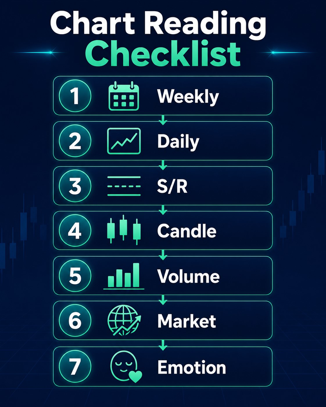
Here is a simple routine beginners can use.
1. Start With the Weekly Chart
The weekly chart helps you understand the larger trend.
Ask yourself:
- Is the asset generally moving higher, lower, or sideways?
- Are recent candles making higher highs and higher lows?
- Is price near a major support or resistance area?
- Are candles getting larger or smaller?
- Is the current move part of a larger trend or just short-term noise?
For long-term investors, the weekly chart can be more helpful than a 5-minute or 15-minute chart. Beginners can practice this by switching between weekly and daily charts on a reliable charting platform. Short-term charts often create noise. Weekly charts reduce some of that noise and show the broader direction.
For example, if QQQ is still in a strong weekly uptrend, a red candle on the daily chart may not mean the larger trend is broken. It may simply show a short-term pullback.
On the other hand, if the weekly chart has already started making lower highs and lower lows, a strong daily candle may need more caution. It could be a bounce inside a weakening trend.
The weekly chart gives the bigger story.
2. Move to the Daily Chart
After checking the weekly chart, move to the daily chart.
The daily chart is useful for seeing recent price behavior more clearly. This is where beginners can look at support, resistance, candle shape, and volume.
Ask yourself:
- Is price pulling back toward support?
- Is price struggling near resistance?
- Are buyers appearing after a decline?
- Are sellers rejecting price after a rally?
- Is volume rising or fading?
- Is the current candle changing the short-term structure?
The daily chart is often a better starting point than very short-term charts. It gives enough detail without becoming too noisy.
For many beginners, the daily chart is where candlestick analysis becomes practical. It helps you observe recent behavior without getting trapped by every tiny move.
3. Mark Support and Resistance
Support is an area where buyers have appeared before. Resistance is an area where sellers have appeared before.
These are not exact lines. They are usually zones.
A common beginner mistake is drawing one perfect horizontal line and expecting price to respect it exactly. Real markets are messier than that.
Support and resistance can help you interpret candles.
For example:
- A long lower wick near support may suggest buyers defended that area.
- A long upper wick near resistance may suggest sellers rejected that area.
- A strong candle closing above resistance may suggest a breakout attempt.
- A failed breakout may warn that buyers are losing strength.
The candle matters more when it appears at an important level.
This is one of the most important lessons for beginners. A candle pattern in a random location is often just noise. A candle pattern near support or resistance can carry more meaning.
4. Check the Candle Shape
After checking the trend and key levels, look at the candle itself.
A large candle body may show strong directional pressure. A small body may show hesitation. A long wick may show rejection.
Here are a few basic interpretations:
| Candle Behavior | Possible Interpretation |
| Large green body | Buyers were strong during that period |
| Large red body | Sellers were strong during that period |
| Long lower wick | Sellers pushed price down, but buyers responded |
| Long upper wick | Buyers pushed price up, but sellers rejected it |
| Small body with long wicks | Indecision or conflict between buyers and sellers |
These are not guarantees. They are clues.
A candlestick is like one sentence in a longer story. You need the surrounding paragraphs to understand it.
If you only look at the candle shape, you may overreact. If you combine candle shape with trend, support, resistance, and volume, the message becomes clearer.
5. Check Volume
Volume shows how much trading activity happened during the candle.
This matters because a price move with strong volume may carry more meaning than a price move with weak volume.
For example:
- A breakout above resistance with rising volume may show stronger buyer interest.
- A breakout with weak volume may be less convincing.
- A long lower wick near support with above-average volume may suggest stronger demand.
- A sharp decline with heavy volume may show real selling pressure.
Volume does not make a signal perfect. But it helps confirm whether the move had participation behind it.
Personally, I pay more attention when price reacts near an important level and volume increases at the same time. It does not guarantee anything, but it tells me more people were involved in that move.
Weak volume does not always mean a move will fail. But it does mean beginners should be careful about treating the move as a strong signal.
6. Consider Broader Market Conditions
Candlestick charts should not be read in isolation.
A stock chart can look strong, but if the broader market is under pressure, the setup may be riskier. A growth stock may struggle if Treasury yields are rising and investors are reducing risk. For broader context, investors often monitor Federal Reserve policy because interest-rate expectations can affect growth stocks and market sentiment.
For example, if NVDA shows a strong candle but the Nasdaq and QQQ are both weakening, a beginner should be more careful. The individual chart may still matter, but broader conditions can affect follow-through.
A simple question helps:
Is this chart moving with the market, against the market, or ignoring the market?
That question alone can prevent many beginner mistakes.
If the broader market is strong, bullish setups may have better follow-through. If the broader market is weak, even good-looking candles can fail quickly.
Realistic Market Example: QQQ Pullback Near Support
Imagine QQQ has been in a broader uptrend on the weekly chart. Readers can check the latest QQQ chart on Yahoo Finance or another reliable charting platform before applying this example.
Price approaches a previous support area. During the session, sellers push price lower. But by the close, buyers push it back up. The candle forms a long lower wick near support, and volume is higher than in recent days.
A beginner might look at that candle and say:
“This is bullish. I should buy.”
That is too simple.
A better interpretation would be:
“Buyers reacted near support, and the long lower wick shows demand appeared during the session. Higher volume makes the reaction more interesting. But I still need to see whether price can follow through in the next few candles, whether QQQ remains above support, and whether the broader Nasdaq market is stable.”
This is the difference between reading a chart and blindly reacting to a pattern.
A more practical beginner approach is to create two scenarios.
Scenario 1: Support Holds
If QQQ stays above the support area and the next candles show stronger closes, the rebound case becomes more convincing.
In that case, the long lower wick may have marked a short-term demand area.
Scenario 2: Support Breaks
If QQQ breaks below support with heavy volume, the bullish interpretation becomes weaker.
In that case, the long lower wick was not enough. Sellers regained control, and risk increased.
This is how beginners should use candlestick charts.
Do not treat one candle as a final answer. Use it as the beginning of a structured analysis.
Candle Patterns Matter Less Than Location
Beginners do not need to memorize dozens of candlestick patterns. A few basic candle behaviors are enough to start.
The most important thing is not the pattern name. It is the location of the candle.
Long Green Candle
A long green candle shows buyers were strong during that period.
But it does not always mean the asset is safe to buy. If the candle appears after a huge rally and near resistance, it could also be a late-stage move where many beginners chase emotionally.
Ask yourself:
- Is the candle breaking above resistance?
- Is volume supporting the move?
- Is the broader trend healthy?
- Is price already extended?
A long green candle is stronger when it appears after a healthy pullback, near support, or during a confirmed breakout with volume.
It is riskier when it appears after a crowded rally and far above support.
Long Red Candle
A long red candle shows sellers were strong.
But one red candle does not always mean the larger trend is broken. In an uptrend, a red candle may simply be a pullback.
Ask yourself:
- Did price break support?
- Was volume unusually high?
- Is the weekly trend changing?
- Is the broader market selling off?
A long red candle near major support can be a warning, especially if volume is high. But a red candle inside a normal pullback may not be enough to change the bigger picture.
Doji Candle
A doji has a small body and often shows indecision.
It can appear before a reversal, but it can also appear during normal sideways movement. A doji is more meaningful near support, resistance, or after a strong trend.
A doji alone is not a trade plan.
The better question is:
Why is the market hesitating here?
If a doji appears after a strong rally near resistance, it may show that buyers are losing momentum. If it appears after a decline near support, it may show that selling pressure is slowing.
But you still need confirmation.
Hammer-Style Candle
A hammer-style candle has a small body and a long lower wick. It often gets attention when it appears after a decline.
The key question is location.
A hammer near support after a pullback may suggest buyers are starting to respond. But if the broader trend is still weak and volume is low, the signal may not be reliable.
A hammer in the middle of nowhere is much less useful.
Shooting Star-Style Candle
A shooting star-style candle has a long upper wick and often appears after a rally.
It may show that buyers tried to push price higher but sellers rejected the move. This can be more meaningful near resistance.
Again, confirmation matters. One rejection candle is not enough by itself.
If the next candle also shows weakness, the warning becomes stronger. If price quickly recovers and breaks higher, the rejection may have been temporary.
Beginner Mistakes When Reading Candlestick Charts
Candlestick charts are useful, but they can also create overconfidence.
Here are common mistakes to avoid.
Mistake 1: Memorizing Patterns Without Context
Many beginners search for candlestick pattern lists and try to memorize every name.
The problem is that the same pattern can mean different things depending on trend, support, resistance, volume, and market conditions.
A long lower wick near support is different from a long lower wick in the middle of nowhere.
Pattern names are not useless. But they should come after context, not before it.
Mistake 2: Using Short Timeframes Too Early
A 5-minute chart can make every move look urgent.
For beginners, this often leads to emotional decisions. One red candle feels scary. One green candle feels exciting.
A better habit is to start with weekly and daily charts first. Only use shorter timeframes after you understand the bigger picture.
Short timeframes are not wrong. But they require more discipline. Without a larger view, they can make beginners overtrade.
Mistake 3: Ignoring Volume
A breakout with weak volume may fail quickly. A reversal candle with strong volume may deserve more attention.
Volume is not perfect, but ignoring it removes an important layer of information.
If price moves strongly but volume is very weak, ask whether enough buyers or sellers are really participating.
If price reacts near support or resistance with higher volume, the candle may deserve closer attention.
Mistake 4: Thinking One Candle Is Enough
One candle can start a question, but it should not finish the analysis.
A better process is:
- What is the larger trend?
- Where is support?
- Where is resistance?
- What does the candle show?
- Does volume confirm it?
- What is the broader market doing?
This keeps beginners from treating candlesticks like fortune-telling.
One candle can be useful. But one candle is rarely enough.
Mistake 5: Looking Only for Bullish Signals
Beginners often want the chart to confirm what they already believe.
If they like a stock, they search for bullish candles. If they dislike a market, they focus only on bearish signals.
A more balanced approach is to ask:
“What would prove my interpretation wrong?”
That question can protect investors from emotional chart reading.
For example, if you think a support bounce is forming, ask what would cancel that idea. Maybe it is a daily close below support. Maybe it is heavy selling volume. Maybe it is weakness in the broader market.
Good chart reading is not about forcing the chart to agree with you. It is about staying flexible.
How to Use Candlestick Charts Without Relying on Them Blindly
Candlestick charts should be one part of a broader investing process.
They can help with timing, risk awareness, and emotional discipline. But they should not replace understanding the asset, the market environment, or your own investment plan.
For example, a long-term ETF investor looking at SPY may use candlestick charts to understand whether the market is extended, pulling back toward support, or breaking below a key area.
But the investor should still consider broader factors such as economic conditions, Federal Reserve policy, earnings trends, inflation, valuation, and personal risk tolerance.
A trader may use candlesticks more actively. A long-term investor may use them more slowly.
The tool is the same, but the purpose is different.
The danger begins when beginners use candlestick charts as automatic buy or sell signals.
A healthier mindset is:
“Candlesticks help me ask better questions. They do not give me perfect answers.”
That mindset is especially important for beginners. It reduces the pressure to predict every move and helps you focus on risk, structure, and probability.
A Simple Candlestick Checklist for Beginners
Before reacting to a candle, use this checklist.
| Question | Why It Matters |
| What does the weekly chart show? | Helps identify the larger trend |
| What does the daily chart show? | Shows recent price behavior |
| Is price near support or resistance? | Gives the candle more context |
| What is the candle shape? | Shows buyer and seller behavior |
| Is volume rising or falling? | Helps judge participation |
| What is the broader market doing? | Reduces isolated chart mistakes |
| Am I reacting emotionally? | Prevents chasing or panic selling |
This checklist is simple, but it can keep beginners from making rushed decisions.
If you only remember one thing from this article, remember this:
Do not read a candle by itself. Read it inside the chart structure.
Personal Perspective: What I Watch First
When I look at candlestick charts, I try not to start with a prediction.
I start with structure.
First, I want to know whether the asset is trending or moving sideways. Then I look for obvious support and resistance zones. After that, I pay attention to candle behavior near those zones.
If a stock forms a strong candle in the middle of a random range, I usually do not treat it as very meaningful.
But if the same candle appears near a major support area, volume is stronger, and the broader market is stabilizing, I pay more attention.
That does not mean the setup will work. It only means the chart is giving a clearer message.
For beginners, this is an important shift.
The goal is not to find a perfect candle. The goal is to build a repeatable way to read price behavior.
In my view, candlestick charts become useful when they help you slow down. Instead of asking, “Should I buy now?”, you begin asking, “What is the market showing me, and what would make this view wrong?”
That is a much better starting point.
I also try to avoid making a decision immediately after one emotional candle. When a candle catches my attention, I usually wait to see whether the next few candles confirm the same message. This simple habit helps me avoid chasing a move that has already happened.
Candlestick Charts and Risk Management
Candlestick charts can help investors understand risk, but they cannot remove risk.
A good-looking candle can fail. A breakout can reverse. A support level can break. A market can change after unexpected news.
That is why beginners should avoid putting too much confidence in one chart signal.
Instead, think in terms of scenarios:
- If price holds support, the chart may remain constructive.
- If price breaks support with heavy volume, risk may be rising.
- If price rejects resistance repeatedly, buyers may be losing strength.
- If the broader market weakens, individual setups may become less reliable.
This kind of thinking is more useful than trying to be right on every candle.
Candlestick charts are not about certainty. They are about reading evidence.
When the evidence is mixed, patience is also a decision.
Practical Investor Takeaway
Candlestick charts for beginners are useful because they show how buyers and sellers behave during a specific period.
But the candle itself is only one piece of evidence.
A beginner should read candlesticks in this order:
- Start with the weekly chart.
- Check the daily chart.
- Mark support and resistance.
- Study the candle shape.
- Confirm with volume.
- Compare the chart with broader market conditions.
- Avoid making decisions from one candle alone.
The best use of candlestick charts is not blind prediction. It is better observation.
When used properly, candlestick charts can help beginner investors slow down, avoid emotional decisions, and understand market behavior more clearly.
The key is not to memorize every candle pattern. It is to build a repeatable process.
Final Thoughts
Candlestick charts are popular because they make price action visual. They show fear, confidence, hesitation, rejection, and momentum in a way that is easy to see.
But they are not shortcuts.
A beginner who only memorizes candle names may still make poor decisions. A beginner who learns to read candles with trend, support, resistance, volume, and market context will build a much stronger foundation.
The key is not to ask:
“Is this candle bullish or bearish?”
A better question is:
“What is this candle telling me about buyers and sellers, and does the broader chart support that message?”
That question turns candlestick charts from a guessing tool into a practical investing framework.
❓ FAQ
Q1. What are candlestick charts for beginners?
Candlestick charts show the open, high, low, and close of an asset during a specific time period. For beginners, they are useful because they show buyer and seller behavior more clearly than a simple line chart.
Q2. Are candlestick charts reliable?
Candlestick charts can be useful, but they are not always reliable by themselves. Their meaning depends on trend, support, resistance, volume, and broader market conditions.
Q3. Should beginners memorize candlestick patterns?
Beginners should understand basic candle behavior, but memorizing dozens of patterns is not necessary. It is more useful to learn how candles behave near important price levels.
Q4. What timeframe should beginners use for candlestick charts?
Beginners should usually start with weekly and daily charts. Shorter timeframes can be noisy and may lead to emotional decisions.
Q5. Why is volume important in candlestick analysis?
Volume shows how much trading activity happened during a price move. A breakout or reversal candle with stronger volume may deserve more attention than one with weak volume.
📚 Further Reading
[Macro Analysis] Interest Rates and the Stock Market: A Beginner’s Practical Guide
Inflation and Stock Investing: A Smart and Essential Beginner’s Guide
Inflation and stock investing are closely connected because inflation changes how investors think about earnings,…
Trading Volume for Beginners: How to Read It With Price Action
Trading volume for beginners is often explained too simply. Many articles say, “High volume means…
Interest Rates and the Stock Market: A Beginner’s Practical Guide
Interest rates and the stock market are closely connected, but the relationship is not as…
Disclaimer: This article is for educational purposes only. It is not financial advice or a recommendation to buy or sell any specific stock, ETF, cryptocurrency, or other asset. All investment decisions are your own responsibility.